Oolio - the Greece’s Liquid Gold! Premium, organic extra virgin olive oil capturing the essence of centuries-old Greek tradition. Bold, exclusive, and sustainably crafted, every drop promises an authentic taste of Greece to elevate every culinary experience.
Deliverables: Logo design, Visual identity, Packaging design, Tone of voice and messaging
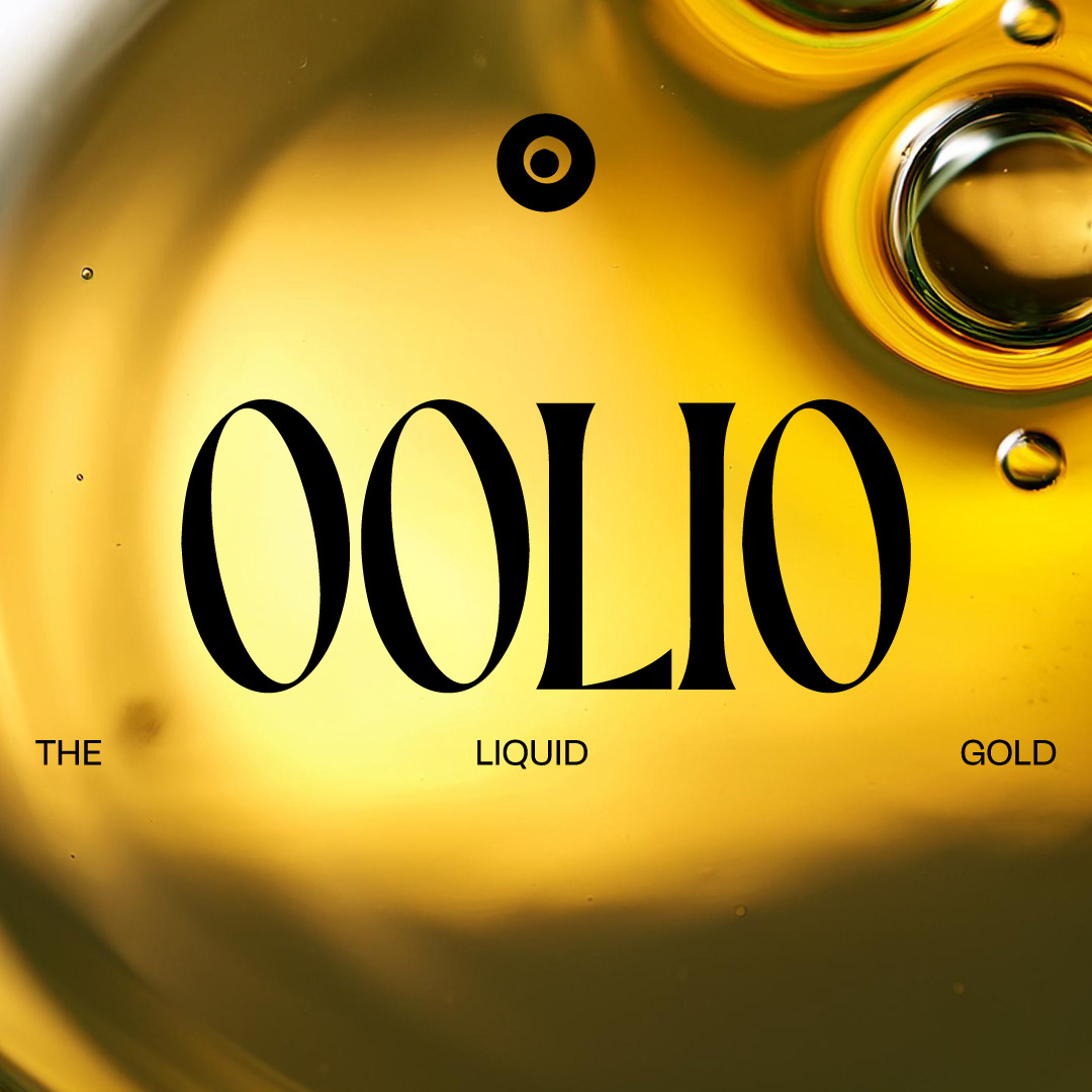
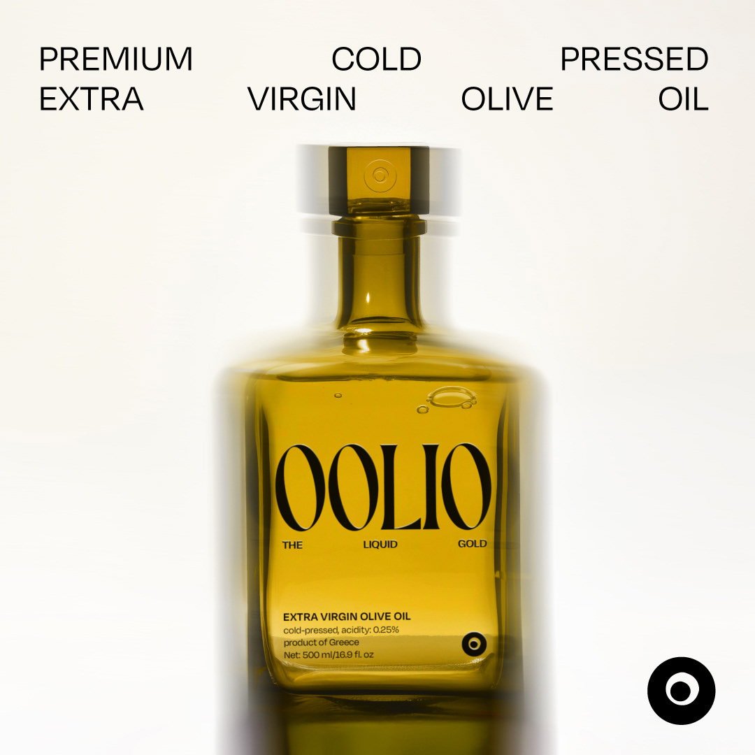
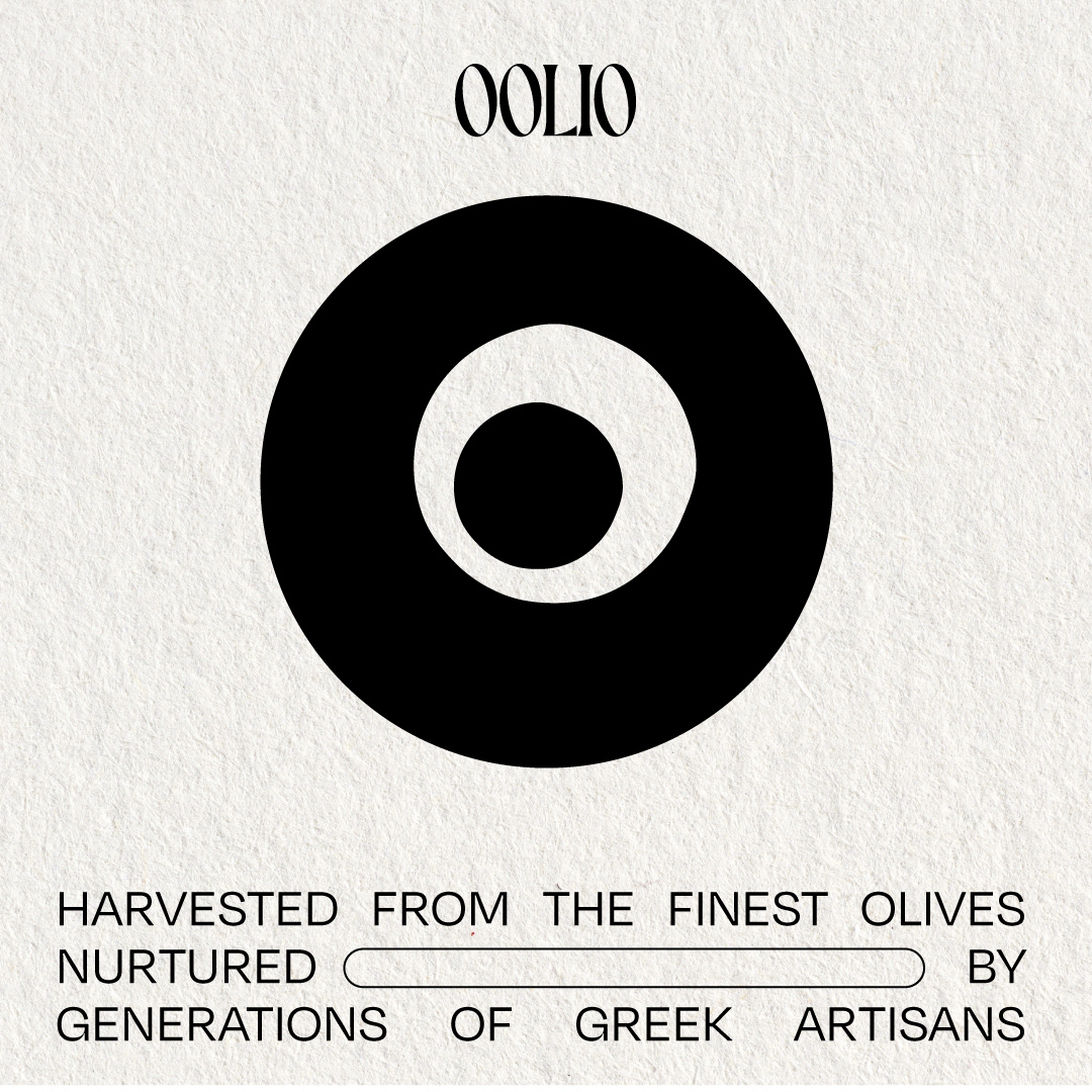
Solution: The Oolio brand identity was crafted to reflect luxury, purity, and a deep connection to Greek heritage. The circular logo subtly references the Greek evil eye symbol, offering protection and tradition, while also resembling an olive oil bubble spill, capturing the product’s essence. This creates a strong link between heritage and the organic purity of the olive oil.
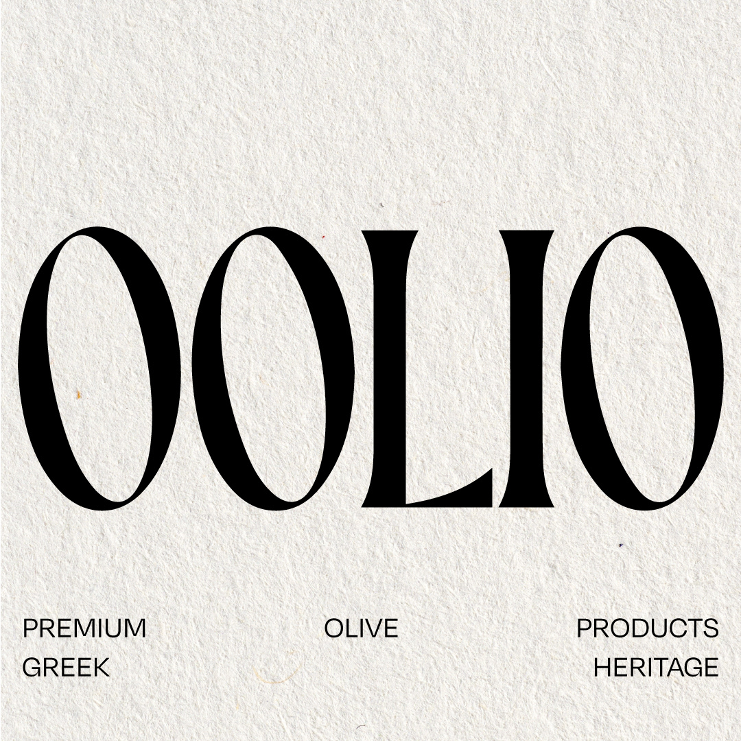
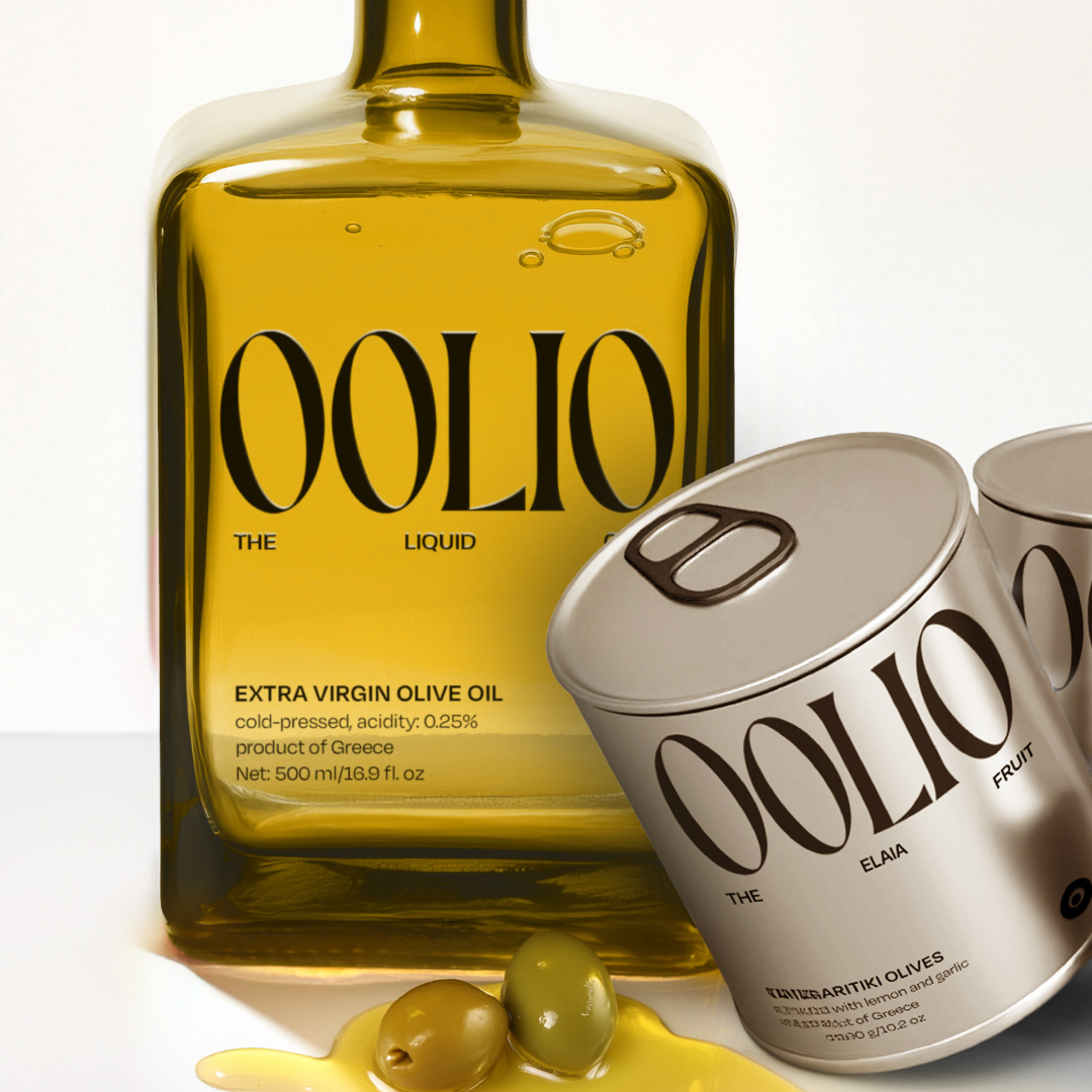
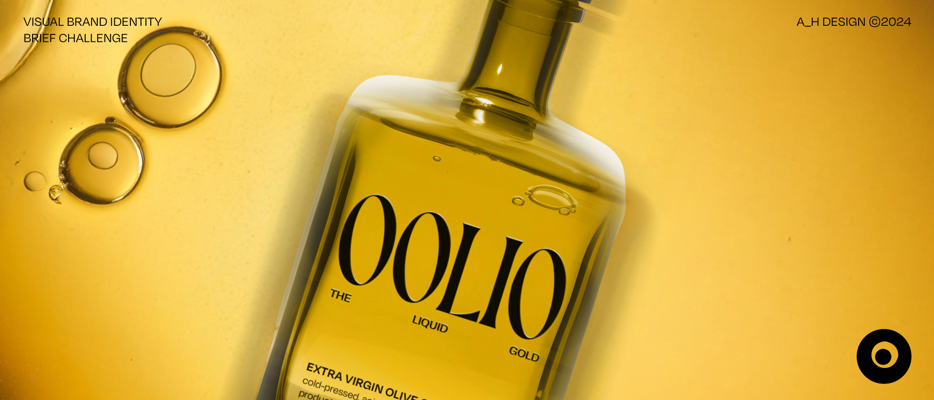
The typography is carefully selected, featuring elegant high-contrast strokes that give the brand a refined, high-end feel. The textured background introduces an organic, natural element, while bold black elements ensure the design remains modern and striking. Metallic tones on the packaging communicate luxury, while the clean, minimalist layout keeps the focus on the product’s artisanal quality.
This design balances Greek tradition with a contemporary, luxurious aesthetic, appealing to consumers who value both heritage and sophistication. Oolio products are more than kitchen essentials in the cupboard—they're crafted to be displayed, adding a touch of luxury and elegance to your countertop as striking design pieces.