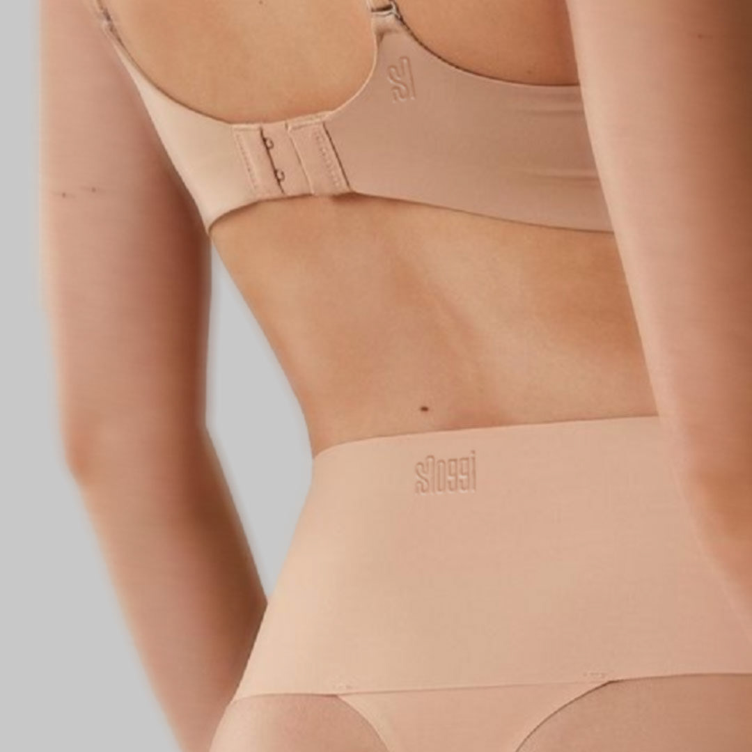
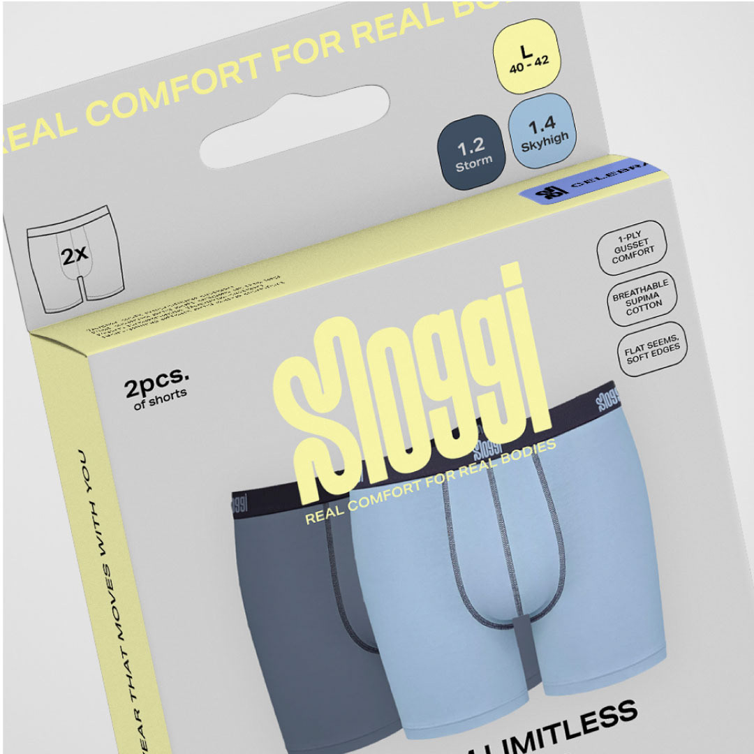
Sloggi is a lingerie and underwear brand known for its comfort-focused designs, innovative fabrics, and seamless, body-hugging fit. Launched in 1979, it offers durable, everyday wear with an emphasis on ease of movement. Sloggi, while known for comfort and practicality, faces several potential challenges in its branding and lack of distinct competitive value proposition within the market and hence we were tasked to generate a new, more bold and fresh identity of the brand, to target younger individuals.
Deliverables: Logo, identity, packaging, POS, digital media content
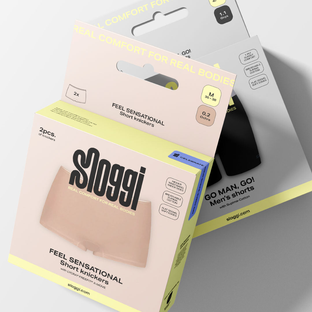
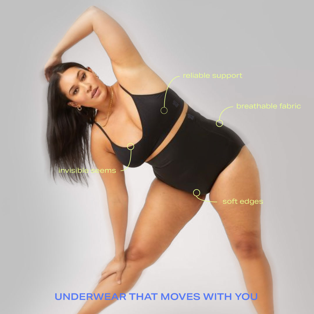
The main problems we have focused on solving with the rebrand has been:
1. Lack of Trend Appeal: Sloggi's emphasis on comfort may come across as less fashionable or trendy.
2. Brand Differentiation: In a crowded underwear market with strong competitors, Sloggi may struggle to stand out. Its messaging on comfort could easily overlap with other brands offering similar benefits.
3. Perceived as Basic: The brand’s utilitarian image could be seen as “basic” or uninspired, making it harder to connect emotionally with consumers seeking more aspirational or lifestyle-driven branding.
4. Inconsistent messaging and Visual Storytelling: Sloggi’s visual branding doesn't always clearly convey a cohesive narrative. Without strong storytelling through its imagery, it risks being seen as generic or lacking personality.
Solution:
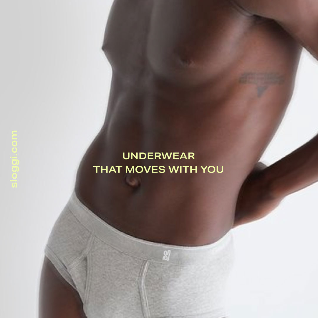
For Sloggi’s new visual identity, we balanced modernity with inclusivity, tailoring the design to appeal to a primary audience of diverse, body-positive consumers while also keeping in mind secondary target groups, such as women 40+ and men. The neutral yet bold design ensures visibility in supermarkets, where clarity and simplicity are key. Soft, versatile colors and streamlined packaging make the product stand out while maintaining a sense of neutrality. The branding carries a clean, approachable aesthetic, blending comfort and accessibility across all consumer segments.
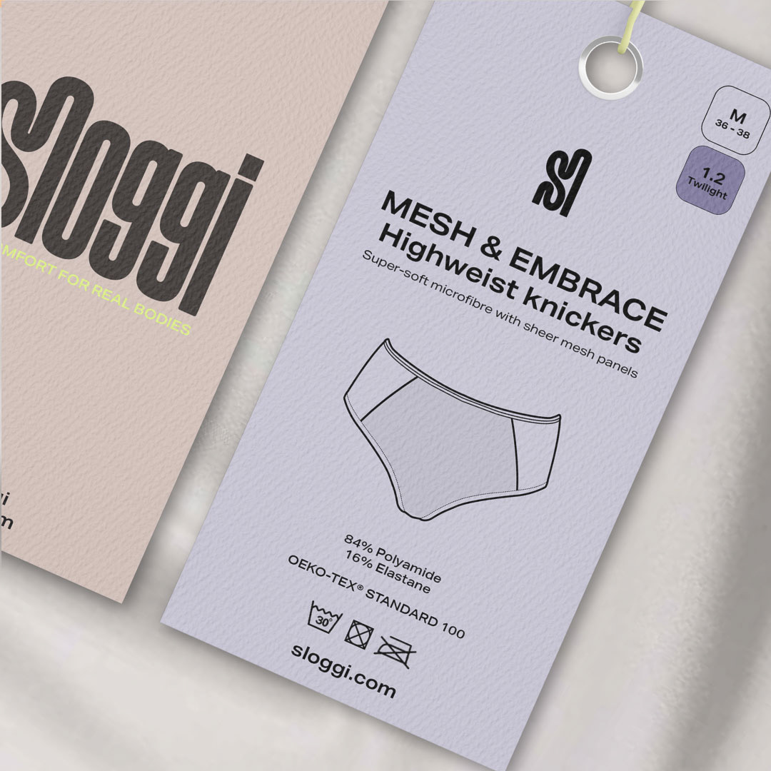
Logo:
With the logo design choices, we aimed to capture the essence of the brand, designing a clean and minimalistic carefully crafted mark with enough distinctive character to stick with consumers.The Sloggi logo effectively embodies the brand's values of comfort, inclusivity, and confidence by using smooth, organic shapes that mimic the natural contours of the human body. The integration of rounded forms mirrors the product's core focus — seamless, comfortable, everyday underwear. The smooth, connected shapes suggest something that fits snugly and seamlessly, much like the products themselves. The continuity in the design represents the continuity and smoothness of the fabrics Sloggi uses, which flow across the body without interruption or discomfort.
The logo aims to communicate inclusivity not only through its soft curves but also through its balance of width and height. It avoids extremes, just as the brand aims to avoid exclusion by providing products for all body types. This universality is subtly reinforced by the proportional and approachable forms, making it a logo that can appeal to a wide demographic, rather than targeting a niche.
The minimalist design keeps it clean and approachable, while subtle stylistic choices, like the unique curves in the letters, give the logo enough personality to stand out and be memorable. Overall, the logo communicates the brand’s philosophy of seamless comfort with a modern, inclusive appeal.

