Zingy is the game-changer in the world of fermented and pickled products, bringing a spicy zing full of taste and color to your everyday condiments. Designed for those who crave bold flavors and aren’t afraid to push boundaries, Zingy transforms traditional pickles and ferments into something fresh, exciting, and full of attitude. With a rebellious spirit and a zest for life, Zingy is here to add a kick to your kitchen and make every bite an adventure.
Deliverables: Brand name, Brand identity and strategy, Brand positioning, Tone of voice, Logo design, Packaging design, Secondary packaging and collateral
The objectives:
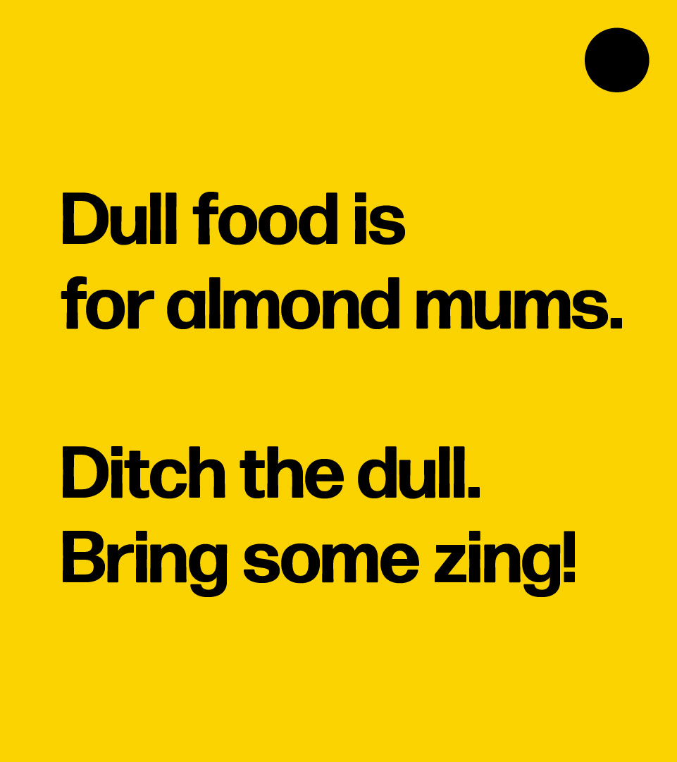
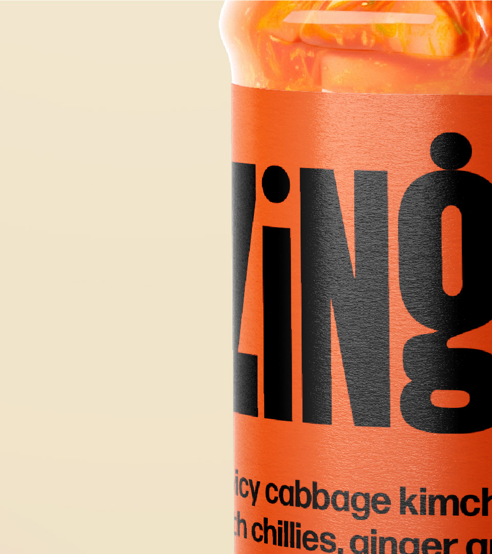
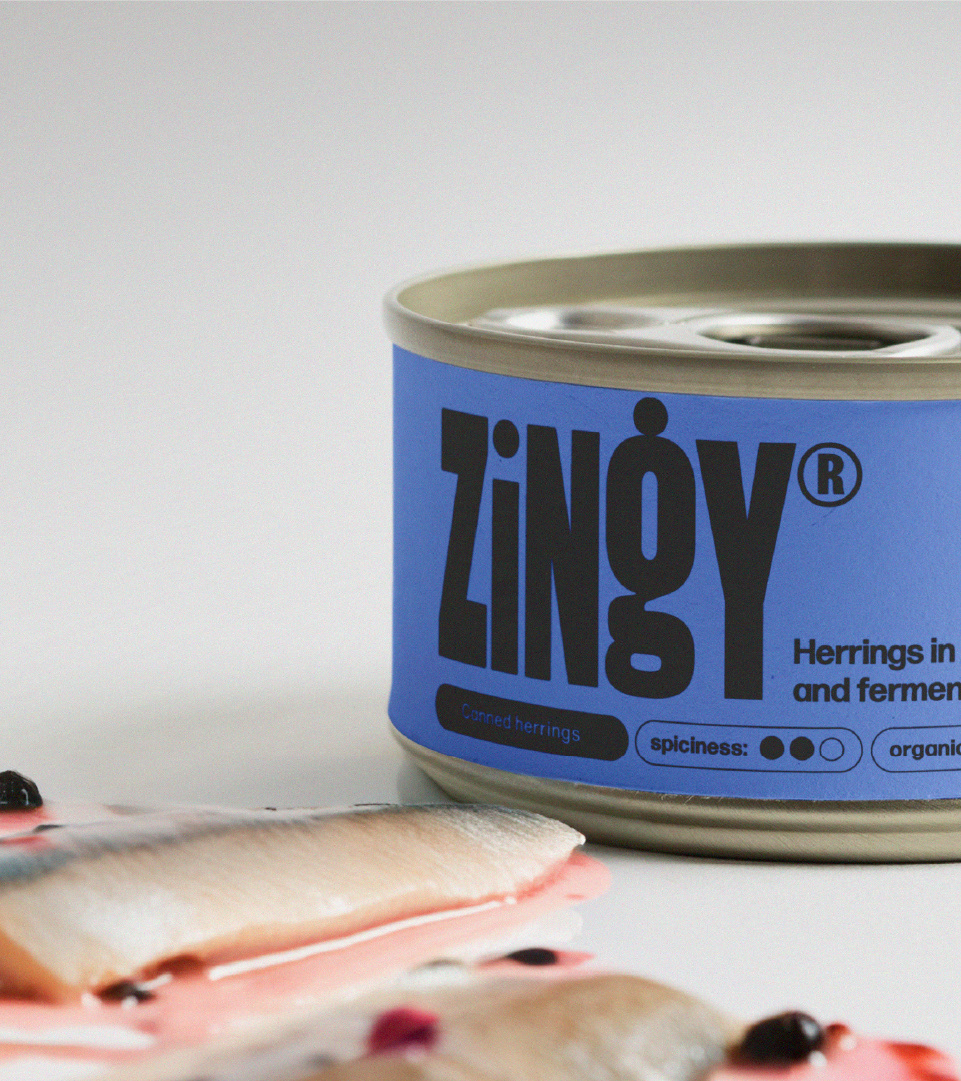
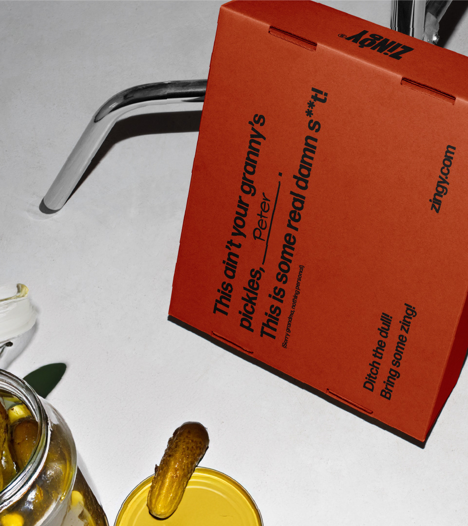
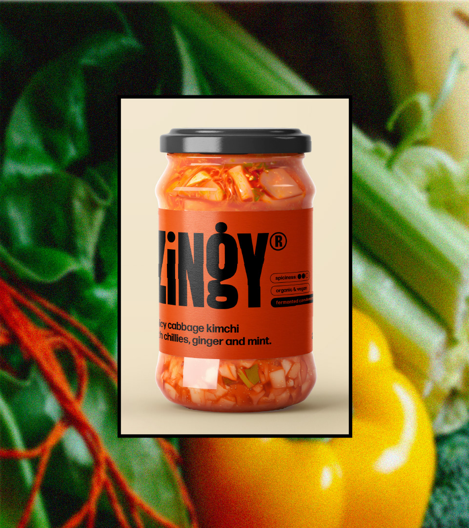
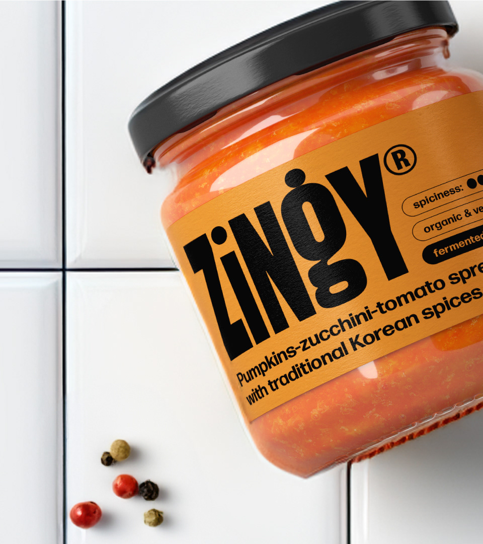
For the Zingy brand identity and packaging design, the goal was to shake up the traditional image of fermented and pickled products on supermarkets shelves, making them as bold and strong as their spicy flavor profile. Targeted at Gen Z and young Millennials, I crafted a rebellious and slightly provocative tone of voice that challenges the norm while keeping the visuals simple, approachable yet fun. The design features vibrant colors reflecting the saturated flavors of the products, bold typography that grabs attention while providing clear understanding of the product features, and overall graphics that capture the zingy essence of the products, ensuring Zingy stands out on the shelves, brings color to the fridge and appeals to a new generation of flavor-seekers.
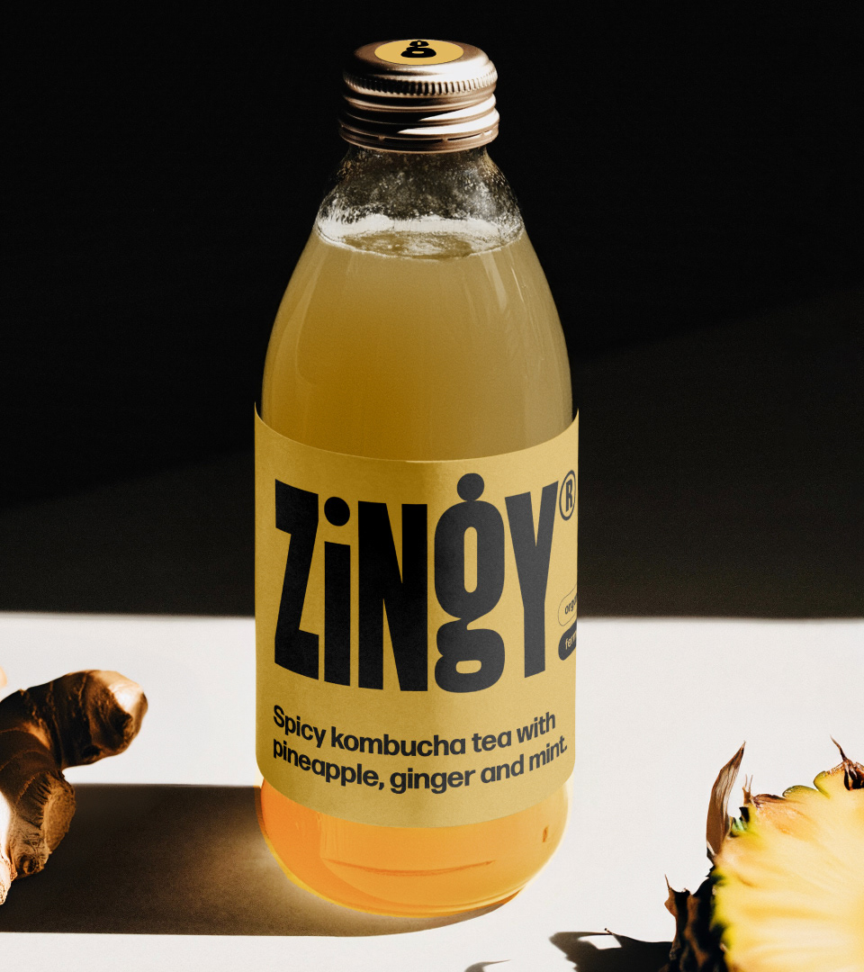

The name: "Zing" is a term that refers to a quality of excitement, energy, or liveliness. It's often used to describe something that adds a spark or flair to a situation, such as a witty remark, a spicy flavor, or a dynamic personality. The term aptly captures the essence of the brand and its product features and is often found in a slang of young generations.
